Android 11's first "beta" release is finally out after numerous delays. The beta release works on the Pixel 2, 3, 3a, and 4, and enrolling for the beta OTA at google.com/android/beta. is super easy. Previously, the Android beta has launched simultaneously on plenty of third-party devices, but that's not the case this year. So far, OnePlus has also shipped the beta, and that's about it. Google says that more devices are coming "in the coming weeks."
The Android 11 Beta has gone through a wild ride. First, it was supposed to debut at the Shoreline Amphitheater for Google I/O in May 12, but the physical event was canceled due to the coronavirus outbreak. Then it was supposed to debut in an online version of Google I/O, but that was canceled, too, as everyone was still trying to deal with the logistics problems the new shelter-in-place requirements. With no release in May, a surprise fourth preview release of Android 11 was created, and the Beta was delayed until June 3, when Google would hold an online event for "The Android 11 Beta Launch Show." The online Android 11 launch show was delayed, too, due to the ongoing nationwide protests against police brutality and the death of George Floyd. In its latest blog post, Google says the online launch show is also canceled entirely, and, surprise, the company is pressing the launch button now with zero fanfare. Not since Google canceled the launch of the Nexus 4 due to Hurricane Sandy in 2012 has a Google launch been such a hot, hot mess.
With the Android 11 Beta finally go for launch, we're still seeing a bit of a mini I/O, even though every event is canceled. Google posted two blog posts, lots of documentation, and 12 videos covering new aspects of Android 11. The company is also planning "11 weeks of Android," a series that will see new developer talks posted each week. So far, the lack of fanfare seems appropriate for Android 11, which seems like a smaller release than we've gotten in previous years. This beta only has two new standout features we can point to.
The new Quick Settings media player
-
Features with "dedicated spaces" in Android 11 would be the media controls, the new conversation notification section, and suggested apps.
-
The new media player, complete with a new audio output selector in the right screenshot.
-
Support the right API and the media player will be persistent.
-
A gif of the audio output controls.
As for what's actually new in the beta compared to the previous four Android 11 Preview releases, the headline feature seems to be the new media player. One of the themes pointed out in the newly posted System UI developer talk is a "dedicated persistent space" for many key bits of phone functionality, and the media is one of those components getting a custom space.
Before, the media player was a special notification in the notification list, and it had a lot of work poured into it, getting custom controls, colors, and more. Now, the media player is getting its own space in the Quick Settings, above all the notifications. In the beta, you have to turn this option on in the developer settings (it's called "Media Resumption"), but once you do, you'll get the new player for most apps.
The new quick-settings player mostly works like the old notification player. You get a set of developer-defined controls, a seek bar (at least, for now), and the usual song info. The one new feature is an audio output picker, which lets you pick between the phone speaker and any connected Bluetooth devices. It would be nice if this worked for Chromecast devices, but it does not.
One of the additions to the quick-settings player is that you can have multiple players at once. If you have something like a music app and a podcast app that you've played recently, both will live in the quick settings as cards you can swipe between horizontally. Keep in mind there's also a horizontal seek bar on both of these cards, so it's easy to accidentally mess up the seek bar while swiping between apps.
If developers can do some work to make their media player in the carousel persistent, meaning it will stay up there even when the app is shut down, it can persist even through reboots. The idea is that you would always have a place to easily start music or podcasts from where you last left them. Doing this in a way that is not annoying sounds challenging, and for now—with everything as a half-implemented beta that is full of bugs—it's hard to judge. For now, one problem people are running into is that there's also a persistent player on the lock screen, even if you aren't playing media, and that's annoying.
-
The Android 11 Beta media controls aren't finished. The UI in Google's blog posts and slides is a closer-to-final version.Google / Ron Amadeo
-
The new quick-settings media player, and Google's mockup media player, is not as nice looking as the current notification player. I really miss the album-art backgrounds.Ron Amadeo
The quick settings in Android have two display modes: a compact display at the top of the notification panel, and an expanded view when you pull down the notification panel again to reveal the full quick settings. The media player goes right along with this, showing a compact and expanded view for your media controls. Right now, the code shipping in Android 11 beta 1 doesn't line up with the pictures in Google's blog posts and slides, though.
First, the compact media player currently in the Android 11 beta is totally wrong and crazy, and it's next to the quick-settings icons. You get this tiny little media player squished into the left half of the notification panel and the quick settings icons squished into the other half. This layout will probably never see the light of day in a final release. Google shows a different UI in its blog posts and developer slides though, and this UI makes a lot more sense: the compact media player lives below the quick-settings buttons as a full-width player interface, just like the notification media player. The compact view doesn't have a seek bar, but you get album art, song info, controls, and—something that the actual release doesn't do yet—a title bar of sorts at the top, showing the app name and the audio output.
The expanded media player design in the beta release lives above the quick-settings controls, but Google's mockups show it below the quick-settings controls, which we can assume will be the location in the final release. Putting the player below the quick settings will mean it will be around the middle of the screen when the quick settings are expanded, which will be so much easier to reach compared to the very top. This expanded player gets a seek bar and more buttons.
Beta fights alpha
I have to say, I prefer the design of the old notification media player to both the beta quick-settings player and Google's mockup design. It looks like Google is doing away with the background album art that was present in the media notification, which is a shame. Google's mockups and the beta design also put the seek bar in the middle of the player, where the notification had it at the bottom. I keep triggering the seek bar when I want to swipe to switch players, and putting it smack in the middle of the card isn't helping.
For now, the design of the quick-settings media players is kind of a mess. It's a beta, it's buggy, and it's going to change in myriad ways between now and the release.
Suggested apps

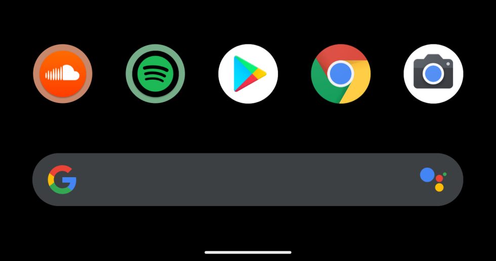
The other feature is new suggested apps functionality on the home screen. Bringing this up is really unintuitive—if you remember one of your existing dock icons, instead of a blank space, you'll get a suggested icon space. The OS will swap in apps here that it thinks you want to use next, excluding the apps that are already on your home screen. Suggested apps get a colored circle around them.
Having a space for suggested home-screen apps sounds like a good idea, but should that place be the dock? Right now, the bottom row of app icons house my most-used apps. I don't really want to remove them and don't need some algorithm to pick my top-five apps. I know what those are. What I don't necessarily know are apps six through 20. It would be nice if this home-screen suggestion thing was somewhere else.
Other than the new power-screen menu, which already launched on Android 10 Pixel devices, that's, uh, just about it for new beta features? So far, Android 11 is shaping up to be a very small release. If you're looking to try the release yourself, be warned that this release is pretty buggy on my Pixel 4, with oodles of black screens and other problems that require a reboot.
Technology - Latest - Google News
June 12, 2020 at 06:53AM
https://ift.tt/30zzZ1i
Hands on with Android 11 Beta 1—A new media player and suggested apps - Ars Technica
Technology - Latest - Google News
https://ift.tt/2AaD5dD
Bagikan Berita Ini


0 Response to "Hands on with Android 11 Beta 1—A new media player and suggested apps - Ars Technica"
Post a Comment